
Happy Sunday everyone! I hope everyone is having a fantastic weekend so far! I managed to catch the X-Men movie, went for a dim sum dinner at Tim Ho Wan and had a hair cut and dye at Shunji Matsuo yesterday. ^_^
Today, I spent some time selecting and watermarking the swatches I have done last week and here are my picks from the China Glaze Off Shore collection for summer 2014!

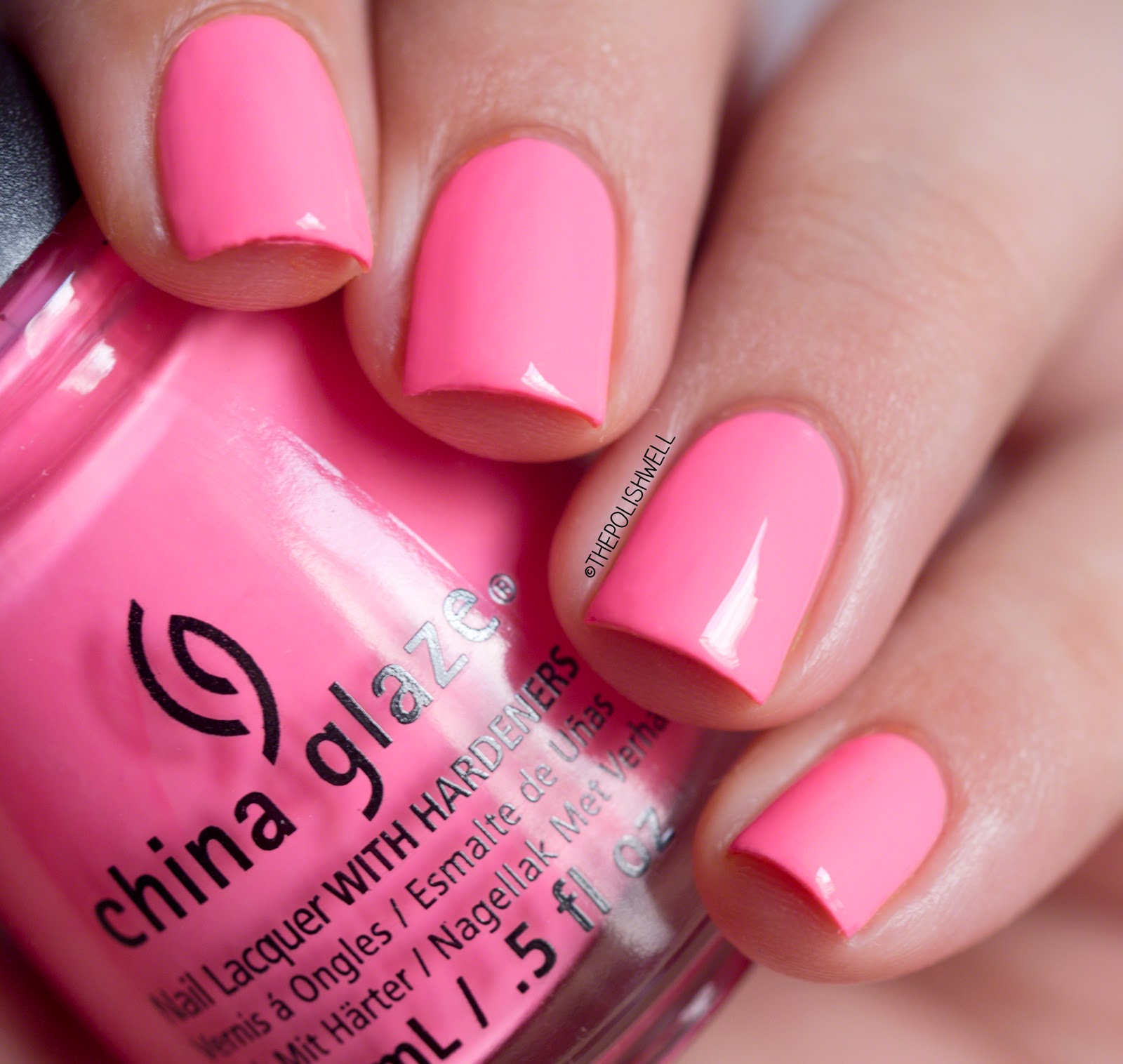
Float On. 3 thin coats.
A bright candy pink. I swear I am starting to appreciate pinks. This is a slightly darker shade than baby pink and has just that hint of maturity / sophistication that made me take a second look as I look through the other swatches online when making my purchase.

Dune Our Thing. 2 thin coats.
A berry pink creme. Bright, happy and flattering. Love it. I think it is safe to say that I no longer not like pinks. o"o

If in Doubt, Surf it Out. 2 thin coats.
A peach-leaning orange pastel creme. Dries slightly darker than how it looks in the bottle. But still juicy nonetheless!

Stoked to be Soaked. 3 thin coats.
A bright orange creme with just a hint of dustiness. Not neon but definitely pops on the tips!

Be More Pacific. 3 thin coats.
A beautiful pastel lime green. Not quite neon but very summery and refreshing looking! Super love!

Shore Enuff. 3 thin coats.
A bright green creme. Slightly darker than OPI You're So Outta Lime. I don't really have words to describe it but I love it. I swear I am loving all the summer greens this year <3

Wait N' Sea. 3 thin coats.
Now how do I describe this colour... a slightly dusty teal-leaning blue? At first coat, I thought it would be another Isle See You Later (too sheer) but the colour quickly built up on the second coat and I added a third for good measure. Colour is right up my alley.

I Sea the Point. 3 thin coats.
Oh hello gorgeous~ A bold bright blue brain-blowing beauty (see what I did there? ;p). I hesitated to buy it initially because I heard the formula is slightly tricky. And it is true - application feels slightly unusual - but it is too pretty to pass up. I would recommend a good shake of the bottle, thin coats, slightly quicker strokes and not to go over the same spot too much. Any patches can be covered by the next coat when the previous coat dries. It has the same distinct smell as Revlon Royal and OPI Eurso Euro so I suspect they use the same pigments thought I Sea the Point appears to be brighter (I suspect it has neon pigments too because it dries slightly matte).
So what do you think of these colours? Which colours from this collection caught your eyes?


I like the greens the best, but I prefer the OPI neon greens this summer. Thanks for sharing!
ReplyDeleteGorgeous collection! I was just pondering if I should buy these or not when I was at Sally's yesterday!
ReplyDeleteThe entire collection is so gorgeous!
ReplyDeleteMy pleasure! I really do love all the greens but if I had to choose I would go with the OPI one too!
ReplyDeleteI would definitely recommend picking them up! :D
ReplyDeleteI am glad you like them too!! ^_^
ReplyDeleteWhat you're saying is completely true. I know that everybody must say the same thing, but I just think that you put it in a way that everyone can understand. I'm sure you'll reach so many people with what you've got to say.
ReplyDeleteWhat you're saying is completely true. I know that everybody must say the same thing, but I just think that you put it in a way that everyone can understand. I'm sure you'll reach so many people with what you've got to say.
ReplyDelete